Monitoring a Hot Tub or Pool with Azure Monitor and Azure Log Analytics Part 3 – Dashboarding with Azure Monitor workbooks
Part 1 – Hardware and Software Setup || Part 2 – Azure Setup || Part 3 – Dashboarding and Workbooks || Part 4 – Alerting || Part 5 – Tips and Tricks
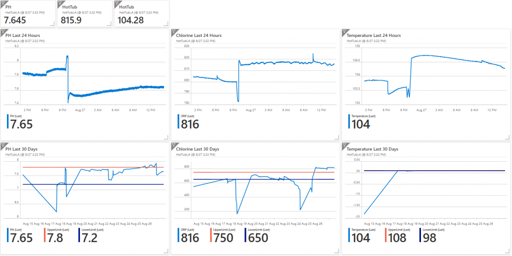
In part 3 we are going to build a dashboard like this to chart out history and progress of our water.
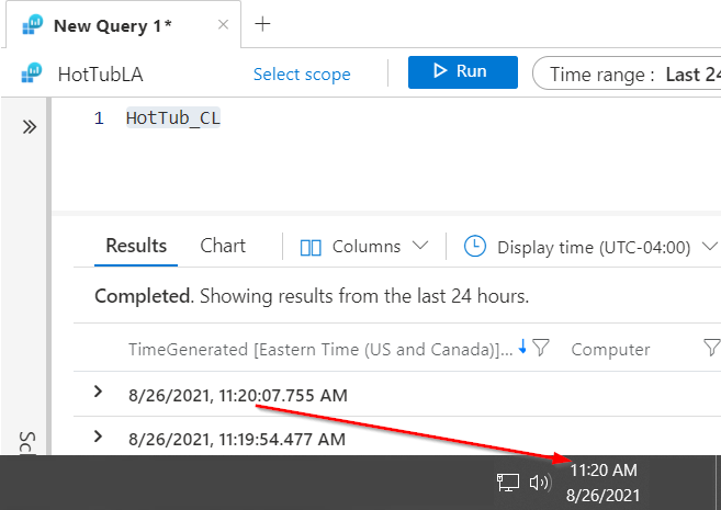
In Azure go to your Log Analytics workspace and verify the data is coming in. In Log Analytics query the HotTub_CL table and check the date time of the last entry and make sure its within a few minutes of the current data time .
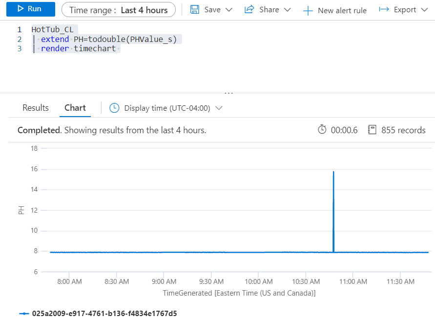
Now lets chart out the data. By default the data is coming in as a string data type. To chart the data we need to change it to a double. Type in the following command to chart out the PH data.
HotTub_CL
| extend PH=todouble(PHValue_s)
| render timechart
It should look like this.
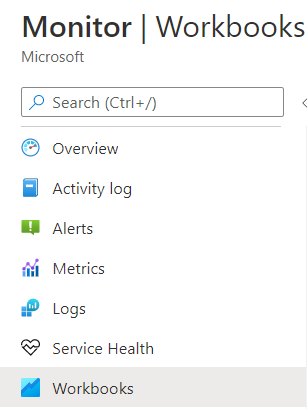
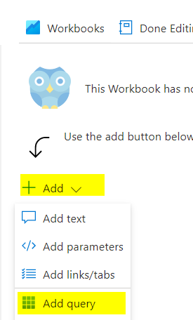
Now lets create some workbooks to show the data. Go to Monitor, Workbooks
Click Add, Add query
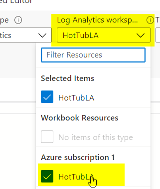
Select your log analytics workspace
Copy and Paste the Query
HotTub_CL
| extend PH=todouble(PHValue_s)
| render timechart
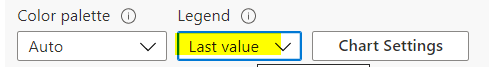
Change the Legend to Last Value and click Done Editing
Repeat the above process to create the ORP and Temperature Graphs. Here are their queries
ORP
HotTub_CL
| extend ORP=todouble(ORPValue_s)
| render timechart
Temperature
HotTub_CL
| extend Temperature=todouble(TempValue_s)
| render timechart
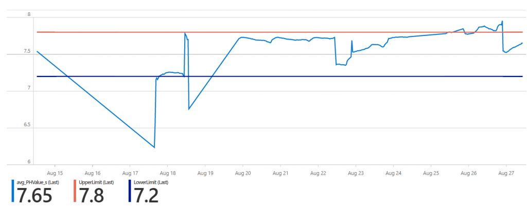
Now I would like to chart out the data over the last 30 days. I also want to set some visual thresholds. For PH anywhere between 7.2 and 7.8 is good.
Here is my query for PH for the last 30 days. This query uses the bin function to round the data to 30 minute intervals, if I tried to use all the data points for the last 30 days the chart wouldn’t render.
HotTub_CL
| where TimeGenerated > ago(30d)
| summarize avg(todouble(PHValue_s)) by bin(TimeGenerated , 30m)
| order by TimeGenerated desc
| extend UpperLimit = 7.8
| extend LowerLimit = 7.2
| render timechart
You can download the entire workbook and Import it into your Azure environment.
Link Click Code, Download Zip
**Note** See Part 5 – Tip and Tricks for how to import and configure the workbook to work in to your environment.
Now that we have all of the charts created lets add them to an Azure Dashboard.
In the portal go to Dashboard.
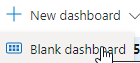
Give the Dashboard a name like HotTub and click Save.
Now click Share

Then click Publish. This will make it easier to find later.
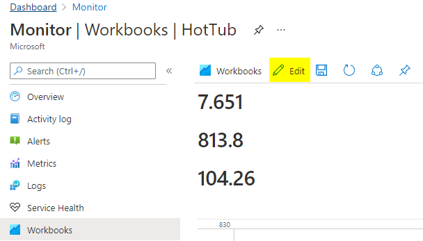
Go back to the HotTub workbook under Monitor, Workbooks. Click Edit
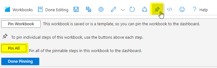
Now click the Pin and select Pin All. (**IMPORTANT** If you don’t click Edit first you won’t get the option to Pin All and your charts won’t show up correctly)
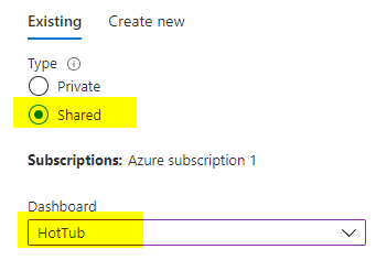
Select Shared and Select the HotTub Dashboard.
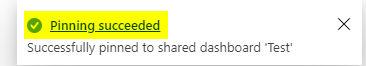
Click the Pinning succeeded to go to your dashboard
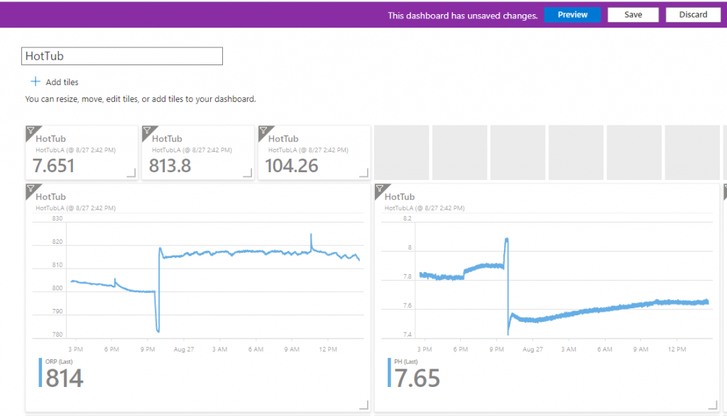
It will bring in all your charts and values. Now we have to clean up the dashboard so it looks nice. Click Edit and start resizing and moving tiles around
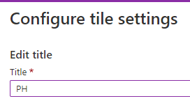
To change the headings. Click the … when you hover over a tile and click Configure tile settings
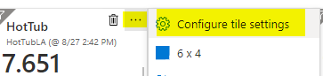
When you give it a name it will replace the HotTub name at the top of the tile.
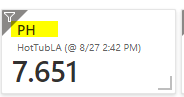
Click Save when you are done. You should now have a complete dashboard.
Next lets setup some alerting so we don’t have to stare at the dashboards all day.
Monitoring a Hot Tub or Pool with Azure Monitor and Azure Log Analytics Part 4 – Alerting